Even though it’s inherently necessary to build your pricing on a value metric, Patrick Campbell, the CEO and co-founder of Price Intelligently, argued that picking the right value metric is crucial for a revenue model’s success.
Imagine two SaaS companies that each have 100 customers. The first charges on a per seat per month schema, but there’s little need for more than one seat for each customer. The other sells the exact same product but charges along a metric of particular usage in the app with a bare minimum per month charge. The former has an artificial ceiling on the MRR potentially gained from their customers. The latter’s MRR will grow as their customers grow and/or use the product more. I’d much rather be in company number 2.
~ Patrick Campbell
He has done a splendid job at condensing the function of a good value metric into three succinct points:
It should be easy for the customer to understand
It should align with the value the customer receives
It should grow with the customer’s usage
Many product designers only think about the product, neglecting the fact that so many good products fail because they didn’t have the right business model to help them succeed. The post above has great examples on value-based pricing, which might feel riskier at points, but it’s definitely the model I would hope to employ as much as possible. Read the full post on the Chargebee blog.
If you’re trying to learn anything about design sprints, it’s hard not to come across content by AJ&Smart. In less than 2 years of putting out content, they’ve managed to become the authority on all things design sprints, whether it’s their generous free content on YouTube and their CEO’s podcast with Sprint author Jake Knapp, or their premium offerings such training or masterclass.
What makes their content good & relevant is that it’s all based on real, on-going design sprint experience. They didn’t run a few design sprints and then pivoted to preaching & teaching. They’ve run over a hundred sprints and it doesn’t look like they’re stopping anytime soon, so I wouldn’t worry about their content becoming out-dated or out-of-touch with how the design sprint process evolves over time. All this to say that when they talk about design sprints, you’re going to want to listen.
AJ&Smart CEO Jonathan Courtney just published a long post detailing how they did remote design sprints to completely redesign Kevin Rose’s meditation app Oak. The whole post is a good read because you rarely see companies talking about their internal projects, but Kevin Rose & AJ&Smart were nice enough to share that publicly. Here are the tips about running remote design sprints:
Be extra-specific when making notes and writing the likes of the How Might We postits — these may need to be read by someone on the other side of the world when you’re not there to explain what you meant.
Double-down on alignment check-ins: there’s a lot more scope for misunderstandings and confusion in a remote Design Sprint, so it’s important to make time for extra check-ins to make sure everyone is on the same page
Extra focus on the Lightning Demos: again because there’s scope for confusion, it’s important to realllllly understand the client’s mindset and what they[re envisioning. It’s harder to do this while not in the same room so we’ll always put a lot of emphasis on them showing us what inspires them, and we’ll also do a bit of extra work on this too (like the Pinterest board)
Have the right toolbox: tools become very important when running a remote Sprint. Don’t let technology ruin your Sprint or let important stuff get lost in emails. See below for what we use when running a remote Sprint
Q: From my experience, defining problems has been a doorway for designers into the world of product and corporate strategy. Have you experienced similar results
A: By having success at bringing an awareness and clear description of actual problems to others through visual narrative, I became viewed as able to analyze what was really the problem and communicate it. Communicators are who get invited back to the table when its time to shape direction. I think this worked for me because I was invited to be a part of many crucial projects at eBay after this point.
Good design goes hand in hand with good communication. Whether it’s fine art or interface design, a design artifact is always trying communicate something visually. The Luke Wroblewski‘s interview with Jamie Hoover presents a real example of how designers can use their visual communication & storytellings skills to make them valuable at the business table, where they get to influence strategy & direction, rather than be confined to a production role and just “making things pretty.”
However, as designers and design organizations move up the design maturity continuum (outlined by Jess McMullin) from pure stylists to problem solvers and framers, they’ll have to increasingly apply their skills toward communicating strategic direction to high-level stakeholders. At which point, understanding how to effectively communicate with design artifacts is a very useful skill.
Luke Wrobleswski makes excellent points for how designers can communicate vision, provide context, and illuminate internally. Read the full post here.
how can design become part of the strategic process? As outlined above, my response is “by helping to define (or redefine) the problem your business needs to address.” Because they research and dissect user needs, designers are in a unique position to define a problem through the eyes of customers. Because they think and act holistically, designers are able to articulate relationships within a market, across product ecosystems, and between customer needs and business goals. Because they can communicate visually and with narrative, designers are able to effectively articulate these definitions to product teams and stakeholders.
If you’re a designer and you follow Jonathan Courtney (you really should), then you know that he’s been hammeringthe point that designer can no longer exclusively concern themselves the user while neglecting the big picture of the business and how it works, lest they be relegated to a production role. Luke Wroblewski was making a similar point above back in 2006. What I found further interesting is his articulation of how designers can bring a perspective to the table when discussing strategy that is unique to them and their relationship to the customer across product ecosystems and with relation to business goals.
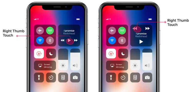
Ever since Apple introduced Control Center iOS 7, they’ve pretty much updated it with each OS release. While iOS 8/9 had minor updates, iOS 10 was a major one which moved to using different cards for system, playback, and HomeKit controls. Then in iOS 11, they gave it another overhaul which moved everything back to one card, sort of. You had to long press/3D touch some controls to get all the options you had in iOS 10. But I was happy to see them move back to the one card metaphor because I hated swiping around to pause my audio in iOS 10.
But while the iOS 11 Control Center was definitely an improvement, I’d hoped that iOS 12 would fix my major annoyance with it: media playback controls. Alas, it’s not going to, based on the iOS 12 preview Apple showed in WWDC ’18. The problem with the media controls in iOS 11/12 is that they’re too small and too close to each other. Combined together those two factors make it very easy to tap the wrong button. When you’re listening to music, it’s annoying to accidentally tap next when you meant to pause because someone is talking to you. And it’s doubly annoying when you accidentally fast forward 60 seconds in a podcast/audiobook and have to rewind back to where you were when all you wanted to do was pause! The nightmare scenario is when I’m jogging and trying to hit one of those damned buttons. I either have to twist my thumb to try and touch as little of the screen as possible or I have to 3D touch the play controls to some reasonably spaced controls. Both solutions suck.
For some inscrutable reason, Apple decided to jam the previous/play/next buttons with only 3mm between each button and the next, with the buttons themselves not exceeding 4mm in width. The problem is that most people use their thumbs for most their interactions with their phone, and a thumb’s contact surface area with a screen can easily take up 7–10mm.
As you can see in the chart above, touch targets under 5mm cause an exponential increase in tapping error rates. What drives me nuts about this is this isn’t a hard problem to solve: make the buttons bigger and space them apart! It’s really that simple. Apple had it mostly right in iOS 7 through 9, and even 10 if you ignore the annoyance of having to swipe to the Now Playing card. I get that they have reasons for the new designs but that doesn’t mean they have to make it work worse than previous versions. They can still easily fix the current design by moving the buttons around a bit:
Left: iOS 11/12 – Right: Concept Solution 1
Does that look as nice & symmetrical as the current design? Maybe not. But would it work better? Heck yes! No way in that design could you accidentally tap the wrong button unless you had very shaky hands. Apple is known for caring about accessibility but the current incarnation of their playback controls is not an instance of such care.
Don’t like it? Alright, we can do better. Who said we need a square anyway? Why not a rectangle:
Left: iOS 11/12 – Right: Concept Solution 2
There, nice and symmetrical. Again, problem solved. Down sides over current design: none (that I can think of). Take a look at all 3 designs and tell me you still think the current design is better, I dare you:
What do you think? I’m curious to know if you have a better design in mind or if you can think of good reasons to justify the current design over my proposed solutions. I’d love to hear from you.
Have you ever experienced similar pains as I have with media controls in iOS 11? If so, please share this post around so that maybe Apple would notice and fix it. Thank you!
We all use multiple apps everyday. Most of them are fine, in that they do the job. Although a lot of the most popular apps lack refinement. I totally understand prioritizing shipping over perfecting the UI, but it seems a lot of apps don’t put in much work into the interface after shipping the first version of their app.
With frequently used apps, even small annoyances become grating over time. Imagine having the light switch in your bedroom be just a little out of reach so that you have to stretch a bit every time you want to turn it on when you walk in. Imagine having to do that every day. It’s a small thing, but it’ll get on your nerves.
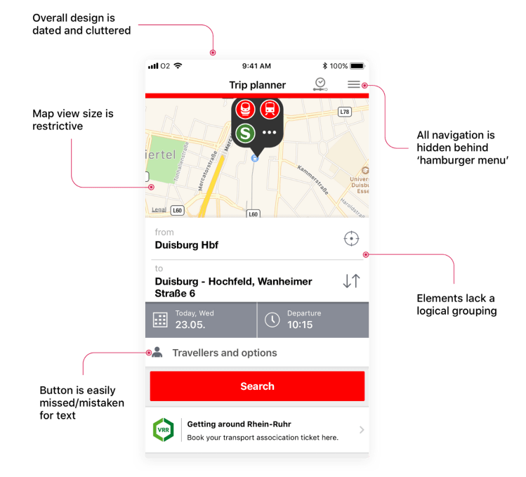
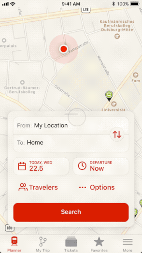
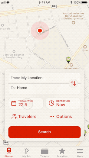
Since I live in Germany and I don’t have a car, I rely on public transport to get around. That means I use the DB Navigator app frequently. And it’s fine for the most part, but I don’t love it. For an app that I use so frequently, I really wish it had more polish. I believe in giving your customers a feeling of joy when they use your product. DB Navigator is neither a joy to use nor to look at. Here are the problems I have with the main screen, aka Trip Planner:
Current Trip Planner in DB Navigator
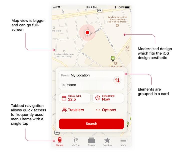
So I took it upon myself to try and come up with a better design that addresses my complaints:
Reimagined Trip Planner (Concept)
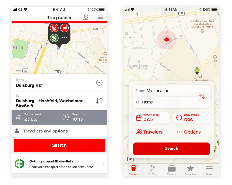
Here are the two designs side-by-side for easy comparison:
Beyond the visual design, small interaction details and animations can make the app more fluid and natural to use, for example:
Dismissing Card Animation
That said, animations can be overused. Having too many animations can add visual clutter and make it slower to navigate an interface if you have to wait for each little animation to play. I believe in subtle, quick animations that serve a contextual purpose or add a flourish that might make the user smile.
For example, the current DB Navigator app uses a fullscreen view to select the date which takes the user to a different context and also takes time since it’s animating the whole screen:
DB Navigator Date Picker
Whereas a more contextual date picker could be faster, while the animation would serve to give the user a sense of where that date picker came from:
Concept Date Picker
Feel free to grab the Sketch & Principle files I made for this redesign.
I had forgotten how wonderful blogging is as a mode of thinking. Blogging is, for me, more about discovering what I have to say, and tweeting more about having a thought, then saying it the right way.
Once I started daily blogging, not only did I have more to link to, it’s actually better stuff
Daily, just consistent, blogging is something I’ve been wanting to achieve for so long, but building new habits is hard.
Ever since I came across the “writing is thinking” mentality, I’ve been a strong believer in it. Writing forces you to put thoughts to words, and when you try to do so, you’re forced to think something through. Sometimes you discover that your thought didn’t make sense, other times you flesh it out more and develop it further.
If you’ve toyed with the idea of blogging but haven’t jumped in yet, or if you’ve never considered it before, I recommend you read Austin Kleon’s full post. It’ll only take you a couple minutes to read and you’ll be happy you read it. Trust me.
Work toward your goals and your dreams, but remember that one day you’ll be dreaming of something you have now. It may be your youth, or your health, or a lost loved one, etc. We will lose things along the way.
A good reminder to snap out of being so obsessed with the chasing the future that we don’t enjoy the things that will not be with us in that supposed happy future.


 Amr Khalifeh