Ever since Apple introduced Control Center iOS 7, they’ve pretty much updated it with each OS release. While iOS 8/9 had minor updates, iOS 10 was a major one which moved to using different cards for system, playback, and HomeKit controls. Then in iOS 11, they gave it another overhaul which moved everything back to one card, sort of. You had to long press/3D touch some controls to get all the options you had in iOS 10. But I was happy to see them move back to the one card metaphor because I hated swiping around to pause my audio in iOS 10.

Source: MacStories
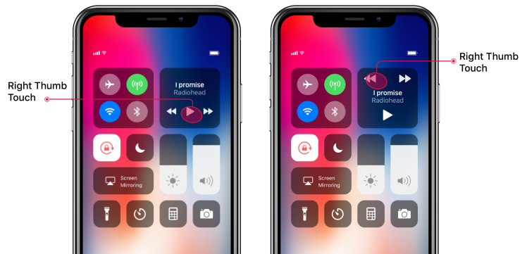
But while the iOS 11 Control Center was definitely an improvement, I’d hoped that iOS 12 would fix my major annoyance with it: media playback controls. Alas, it’s not going to, based on the iOS 12 preview Apple showed in WWDC ’18. The problem with the media controls in iOS 11/12 is that they’re too small and too close to each other. Combined together those two factors make it very easy to tap the wrong button. When you’re listening to music, it’s annoying to accidentally tap next when you meant to pause because someone is talking to you. And it’s doubly annoying when you accidentally fast forward 60 seconds in a podcast/audiobook and have to rewind back to where you were when all you wanted to do was pause! The nightmare scenario is when I’m jogging and trying to hit one of those damned buttons. I either have to twist my thumb to try and touch as little of the screen as possible or I have to 3D touch the play controls to some reasonably spaced controls. Both solutions suck.

For some inscrutable reason, Apple decided to jam the previous/play/next buttons with only 3mm between each button and the next, with the buttons themselves not exceeding 4mm in width. The problem is that most people use their thumbs for most their interactions with their phone, and a thumb’s contact surface area with a screen can easily take up 7–10mm.

Source: Luke Wroblewski – Conversions@Google 2018
As you can see in the chart above, touch targets under 5mm cause an exponential increase in tapping error rates. What drives me nuts about this is this isn’t a hard problem to solve: make the buttons bigger and space them apart! It’s really that simple. Apple had it mostly right in iOS 7 through 9, and even 10 if you ignore the annoyance of having to swipe to the Now Playing card. I get that they have reasons for the new designs but that doesn’t mean they have to make it work worse than previous versions. They can still easily fix the current design by moving the buttons around a bit:
Left: iOS 11/12 – Right: Concept Solution 1
Does that look as nice & symmetrical as the current design? Maybe not. But would it work better? Heck yes! No way in that design could you accidentally tap the wrong button unless you had very shaky hands. Apple is known for caring about accessibility but the current incarnation of their playback controls is not an instance of such care.
Don’t like it? Alright, we can do better. Who said we need a square anyway? Why not a rectangle:

Left: iOS 11/12 – Right: Concept Solution 2
There, nice and symmetrical. Again, problem solved. Down sides over current design: none (that I can think of). Take a look at all 3 designs and tell me you still think the current design is better, I dare you:

Left: iOS 11/12 – Middle: Concept 1 – Right: Concept 2
What do you think? I’m curious to know if you have a better design in mind or if you can think of good reasons to justify the current design over my proposed solutions. I’d love to hear from you.
Have you ever experienced similar pains as I have with media controls in iOS 11? If so, please share this post around so that maybe Apple would notice and fix it. Thank you!
