[et_pb_section fb_built=”1″ admin_label=”section” _builder_version=”3.0.47″ custom_padding=”0|0|48px|0px|false|false”][et_pb_row make_fullwidth=”on” custom_padding=”0|0||0px|false|false” custom_margin=”|0px||0px” padding_right_1=”0px” padding_left_1=”0px” admin_label=”row” _builder_version=”3.5.1″ background_size=”initial” background_position=”top_left” background_repeat=”repeat”][et_pb_column type=”4_4″ _builder_version=”3.0.47″ padding_left=”0px” padding_right=”0px” parallax=”off” parallax_method=”on”][et_pb_text admin_label=”Text” _builder_version=”3.0.47″ background_size=”initial” background_position=”top_left” background_repeat=”repeat”]
We all use multiple apps everyday. Most of them are fine, in that they do the job. Although a lot of the most popular apps lack refinement. I totally understand prioritizing shipping over perfecting the UI, but it seems a lot of apps don’t put in much work into the interface after shipping the first version of their app.
With frequently used apps, even small annoyances become grating over time. Imagine having the light switch in your bedroom be just a little out of reach so that you have to stretch a bit every time you want to turn it on when you walk in. Imagine having to do that every day. It’s a small thing, but it’ll get on your nerves.
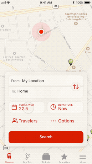
Since I live in Germany and I don’t have a car, I rely on public transport to get around. That means I use the DB Navigator app frequently. And it’s fine for the most part, but I don’t love it. For an app that I use so frequently, I really wish it had more polish. I believe in giving your customers a feeling of joy when they use your product. DB Navigator is neither a joy to use nor to look at. Here are the problems I have with the main screen, aka Trip Planner:
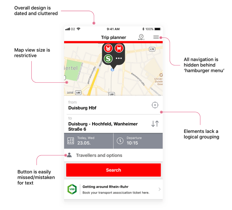
Current Trip Planner in DB Navigator
So I took it upon myself to try and come up with a better design that addresses my complaints:
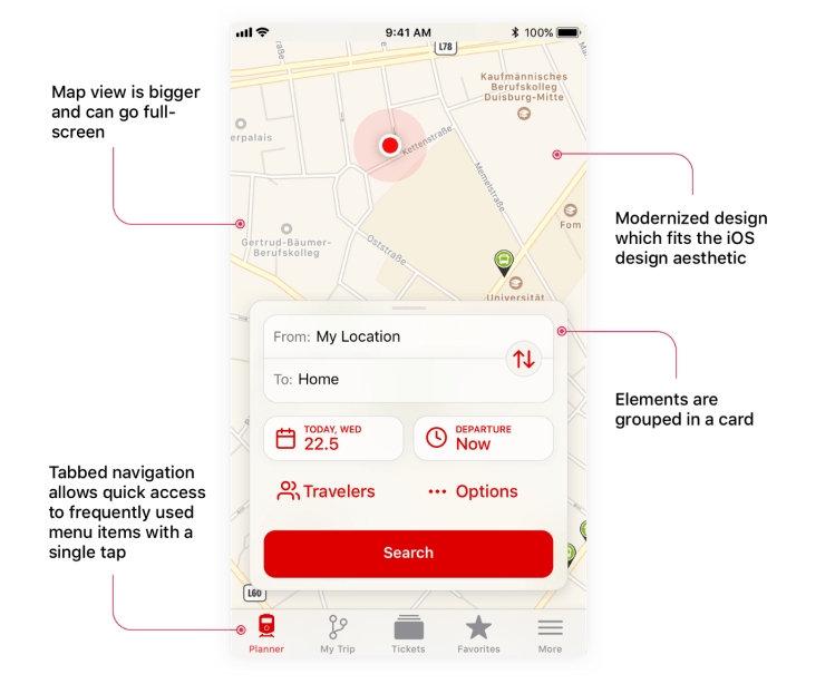
Reimagined Trip Planner (Concept)
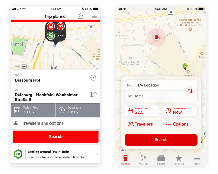
Here are the two designs side-by-side for easy comparison:
Beyond the visual design, small interaction details and animations can make the app more fluid and natural to use, for example:
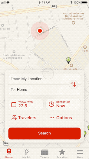
Dismissing Card Animation
That said, animations can be overused. Having too many animations can add visual clutter and make it slower to navigate an interface if you have to wait for each little animation to play. I believe in subtle, quick animations that serve a contextual purpose or add a flourish that might make the user smile.
For example, the current DB Navigator app uses a fullscreen view to select the date which takes the user to a different context and also takes time since it’s animating the whole screen:

DB Navigator Date Picker
Whereas a more contextual date picker could be faster, while the animation would serve to give the user a sense of where that date picker came from:
Concept Date Picker
Feel free to grab the Sketch & Principle files I made for this redesign.
[/et_pb_text][/et_pb_column][/et_pb_row][/et_pb_section]
